
10. Indoor season 2010 – Real men wear pink lilac
Fashionwise, the indoor season has often been the worst period of the year, with too many dull, greyish and rather sad outfits. But not in 2010. Lilac was a great choice: it’s elegant and it's a soft colour, so it kinda follows the tradition of avoiding bright colours during the indoor season, but it’s not boring, or dull, or cheerless, and it doesn’t make you look like someone who urgently needs a sunbath. Plus, in Shangai and partially in Basel


9. AO 2008 (day) – The grown up ballboy
A very nice shade of blue for the t-shirt and a pretty & unusual combination with the shorts. On top of all that, funnily enough he was perfectly coordinated with the ballboys, the umpires and the court itself.


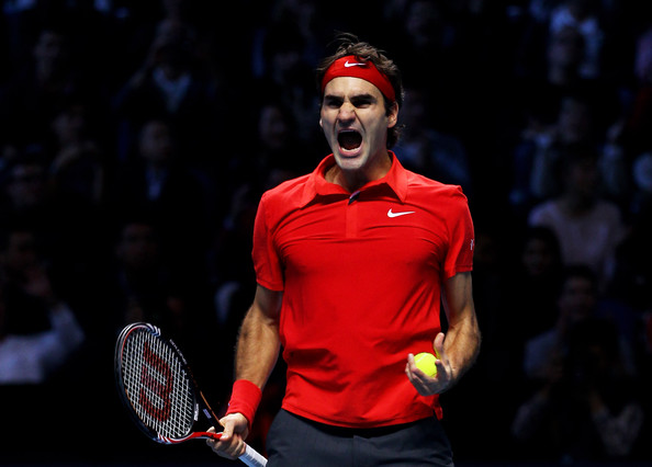
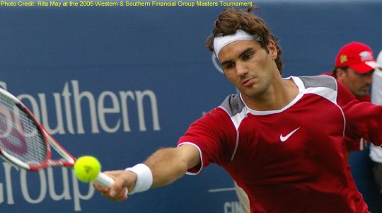
8. Master 2010 – Not a WTF outfit
Likewise with blue, we have seen Federer in red very often (some would say too often). Between all of them, I have picked this one not only because Roger played an amazing tournament wearing it, but also because it’s a beautiful shade of red, bright and cheerful. Plus, the match with the dark grey shorts and jacket is very classy.

7. Montreal/Cincy 2009 – Isn’t daddy pretty?
Coming back to the tour as the happiest man alive, after the EPIC month of July 2009, Roger looked shiny in this bright blue/green. The outfit also included a beautiful sweat jacket with contrasting outlines, an item Federer sported during the entire year (causing in many fans worldwide the urge to buy them all).


6. US Open 2006 – Oh, those shoulders.
Probably the best-fitting t-shirt ever. During 2006 summer, Federer sported these collarless t-shirts, in a white version in Wimbledon (well, DUH!) and in Toronto/Cincy, and in this light blue version at the Us Open. While I’m not really sure about the usefulness of the little holes on the back, those lines on the shoulders are amazing, doing a great job emphasizing Roger’s figure. If only the shorts would have been a little less baggy…


5. Miami
The semifinal v. Djokovic was one of Federer's worst matches ever (certainly one of his worst performances with his forehand), but the outfit was outstanding. Simple, classy and yet not ordinary, thanks in particular to the elegant outlines on the shirt collar. A similar design was used for RG 2009, but I liked this version’s colours best (tenniswise, I enjoyed RG more, though. Guess why?).


4. AO 2006 – Go green
I’m not totally fond of the t-shirt, but the main reason why I picked this outfit is the touches of colour, especially on the bandana and the wristbands. That + Roger’s eyes and tan + the night lights produced some of the most amazing pics ever, like these:


3. US Open 2005 - "cause you were all...yellow..."
The yellow bandana just looks INCREDIBLE. And the shirt is great, too. Love the pattern on the shoulders. The yellow/blue combo was awesome, too bad Nike has given up this path…although it seems like yellow will be back at the beginning of 2011.


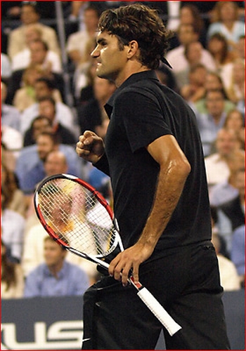
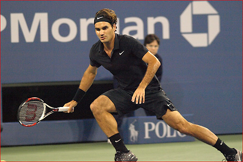
2. US Open 2007 (night) - Darth Federer
Dan dan dan dan dan-da-da-dan dan-da-dan!!...ooops, sorry! I was just singing the Darth Federer Vader theme!
The thing with this outfit is that it was perfectly appropriate to the tournament. Wearing it anywhere else would have been – probably – too much, but for the night matches in Arthur Ashe it just looked perfect: outstanding, audacious, elegant and sexy.
1) Wimbledon 2006 – The“He’s wearing a frikkin jacket??? On court???” outfit
Obviously, in every list like this one, positions will be always determined not only by objective standards, but also by subjective tastes, individual likes and personal memories.
To me – and I believe I’m not the only one – 2006 was the year of the “point of no return”, Rogerwise. Before then, I liked the guy and his tennis, I cheered for him, I would even be upset when he lost, but I was nowhere close to the condition of total craziness I’m in now. Then, in 2006, two things happened: in May, I sat through (live) to one of Roger’s bloodiest defeats ever (Rome 2006 final) and for the first time I felt totally involved emotionally with him; in June, he stepped on court in Wimbledon wearing a beautiful immaculate jacket and there I totally and definitively lost it for him, not only as a tennis player but as a person, too.
Besides that, I really think that it was a perfect outfit. The idea of the jacket was terrific: so classic and yet, nowadays, so original. It was eye-catching and everyone was talking about it, but it wasn’t overdone, it wasn’t too much (which was, on the contrary, the usual criticism towards Federer’s Wimbledon outfit in 2007). Of course, Roger is the only man on Earth who could pull it off; everyone else, standing on a tennis court with a pair of white shorts and a white jacket, would at least look like an idiot (or as an ice cream seller, if he’s lucky).


Honourable mentions:
Clay 2005 & Cincy 2005: two other pretty reds
AO 2010 & US Open 2007 (day): pretty blues
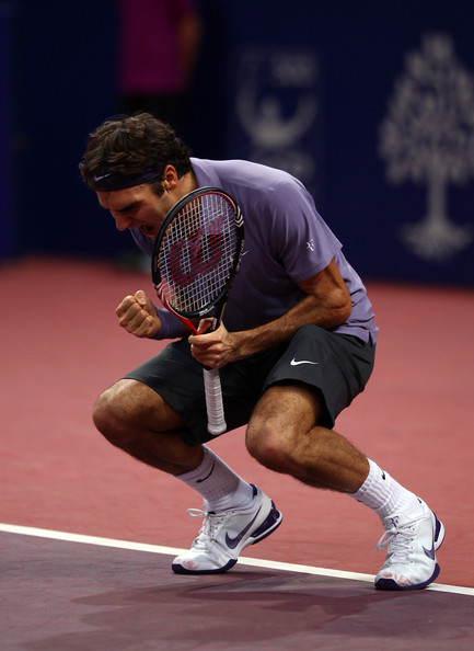
Toronto/Cincy 2010: pink, it was love at first sight
Wimbledon 2008: you can love or hate the cardigan, but…the belt!!! Oooohh, the belt was love.
AO 2008 (night): Darth Federer reloaded, now with touches of blue.
AO 2008 (night): Darth Federer reloaded, now with touches of blue.
So, in the Top 3 we have white, black and colours. Fair enough, what do you think?
Have your say and then stay tuned for a Top Ten of... (shock and horror)... Roger's worst outfits!


